I'd been itching to redesign the Zensations logo for a long time. The individual steps and considerations involved can be applied to any logo design process, and I'd like to explain them briefly to you.
Goal Setting
A clear goal is the alpha and omega of design. It's important to learn and ask yourself (and the client) the right questions.
- Where will the logo be used? (e.g. small, large, print, web, etc.)
- What information does it convey? (Textual e.g. company name, slogan?)
- What emotion should it communicate? (Friendly, Professional, Conservative, Strict, etc.)
- Do I need a brand mark that can stand alone without text?
- What do competitors' logos look like? How can we stand out but still be recognisable as belonging to the industry?
We wanted our logo to feature a brand mark that places us in context even without text and stands out on various social media channels, printed materials, or giveaways. The brand mark should be able to stand alone and have a high recognition value. Zensations should appear calm, modern, and professional.
Sketching
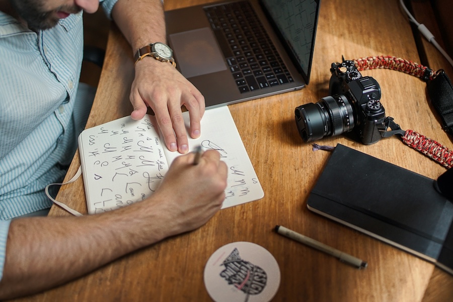
The classic way, with pen and paper. This frees the mind, is quick, and allows for direct exchange with colleagues when you want to communicate your ideas quickly in a meeting. We did a lot of scribbling here too! Important: It doesn't have to be perfect. The aim is to try out and capture your ideas.
Implementation
The sketch is converted into vectors in Illustrator. It quickly becomes clear that there are still numerous variations possible here. It's important at this step to print the logo in 2 different sizes and see if any problems arise. For example, if the slogan is no longer clearly legible, a version with a slightly larger font must be designed for smaller displays. Or, you might choose a generally more legible font. Many critical decisions must be made during this process.
Final Artwork
Now we get down to business. Of course, you shouldn't be sloppy during implementation either. But this is about the fine details that make the difference between a good logo and a free online logo template. Kerning happens here. Stroke weights are adjusted and spacing is measured and defined according to the lowest common denominator. All elements have a fixed place and are aligned with each other. Don't forget to re-check the colours! And not just visually. We don't want CMYK values with decimal places.
I always save the file with the suffix "Open" for myself. Here, the outlines and texts are still open and editable. The logo that is used should under no circumstances still have these options! If someone has a different version of the font or scales the logo incorrectly, a lot of trouble can arise here.
The line weight of the brand mark corresponds to the "I" in "Zensations".
So: Select everything (cmd + A) and do exactly that in the menu with "Object" -> "Expand". All 3 checkboxes (Object, Fill, Stroke) should be checked if available.
Once the logo is established, different versions can be created for various purposes (landscape format, on a dark background, for very small display, with slogan, only the brand mark, ...).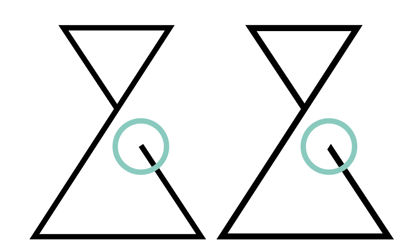 Attention designers: Anything you don't do yourself, the client will cobble together. And nobody wants that.