When a web designer is given free rein, it sounds like an easy task to outsiders. However, as anyone working in a creative field knows, absolute freedom is a terrible thing. My first approach to such a project is therefore to set my own restrictions. For the Drupal 8 Release Contest, this meant for me:
- No stock photos
- No colour
- No flat vector
Why? I wanted to create a website that we don't encounter every day on the web. The three things mentioned above are not inherently bad and certainly have their place. They are simply ubiquitous, and to truly let loose, something more was needed.
The Drupal 8 droplet was at the centre of the concept, and from there, the chain of associations that holds the website together was spun further.
A droplet is part of rain, rain comes from clouds, rain lands in the sea. Logical, right? 😉 Furthermore, I also wanted to incorporate the number 8 as often as possible.
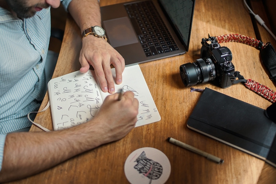
Anyone who has worked with me professionally knows that the first step in my process is sketching. Once the pencil is in hand, I don't put it down easily. So this time, instead of pretty vector icons, I decided to simply draw the required image elements myself on paper. The colouring (grey and white) was then done in Photoshop. Besides the many drawn eights (and yes, we removed quite a few 😉 ), an octopus was, of course, essential. Sebastian, the demigod who implemented this site, insisted that the octopus move. This requires all movable parts to be drawn and supplied individually. Naturally, with a template so the developer knows approximately where each part should sit. Said and done!
Together, in the first concept meeting, our team discussed which statistics we could and wanted to display. The bugs show us how much work still needs to be done on Drupal 8. As I write these lines, the bug count stands at 2,653. So there's still plenty to do! Furthermore, participants and, of course, the tips were suitable additions. Since we had linked the contest with Twitter, it also made sense to count the tweets in which our hashtag was used. The illustrations are in my personal style, which is why they were quick to create. One can congratulate me for working for an agency that has no issues with glowing brains and pupil-less eyes. Cheers! Sabrina also insisted on fish in the sea. After my initial grumbling (too busy on the page/no time/I'm hungry now), I am very happy with the little fish, and after the octopus, they are my favourite element on the page.
What is the Hivemind all about?
The wisdom of the crowd states that a group is smarter than an individual. There's an example from 1906 when, as part of a competition, people had to estimate the slaughter weight of an ox. 787 estimates were submitted. Not a single one was correct. But the average of all estimates hit the bull's eye. So we are not just hosting a contest here, but our own psychological-ecological experiment.
What one might not notice at first glance, and what we didn't want to explicitly communicate (the shorter the better!), is that the clouds become paler the older the tip is, and larger the more people have tipped on that day. The vertical position is left to chance. If you haven't submitted a tip yet, there's no way to see which days or months other participants have chosen. After you've submitted your tip, you'll see what our collective intelligence has achieved. I'm excited to see how far the group's estimate will be from the Drupal 8 release day.
What is your favourite element on the page? How do you feel about the wisdom of the crowd? I look forward to your comments :)a