
We were commissioned by the Web Accessibility Certificate Austria to develop a complete corporate identity and implement their website.
For me as a designer, such a project is always something very special. How often does one otherwise get the opportunity to let their creativity run free? On the other hand, there are no fonts, colours or logos defined that one can base their design on, and you literally start with a blank sheet of paper.
Back to basics – logo design with pen and paper
At the start of the design process, the creation of a suitable logo for the brand identity was on the agenda. The exclusivity and professionalism of the certificate required special attention. But how can a logo convey the right values? Especially when there are so many logos out there already! And that's where my initial approach began – I researched what others had come up with on the topic. Following the motto "know your enemy", it's always good to know what kind of presence similar industries maintain and how one can best stand out from them. It's always interesting to observe how your own outward attention changes when you intensively focus on a topic. It seemed as if dozens of logos suddenly appeared around every corner, which I was absolutely sure hadn't been there before. Everyone knows this feeling – for example, you buy a new car and suddenly you notice how often this vehicle, this brand, or this colour appears on the roads.
In addition, there was a lot of brainstorming, talking and discussion with colleagues. What emotions, symbols, and keywords do they associate with the topic of accessibility? I was amazed at how varied the answers were and how diverse the approaches – should the logo be based on abstract shapes, established icons, or rather on typography? With all these inputs, I grabbed a pen, paper, my headphones, and a pack of Manner wafers, quite old-school, and retreated to a corner. I put everything that came into my head on paper, even if it seemed absurd, until the pencil was smoking. Only to keep realising: "Hmm. I like this approach. This could work! Oh, damn it, that looks quite similar to the logo of brand XY!". At this point, you shouldn't bury your head in the sand, or, as I like to do, throw all your writing utensils against the wall. Many logos are created through long processes to achieve optimal recognition and thus burn themselves into the subconscious. It can also help to discuss sketches with colleagues during the process. They have a different perspective on it and notice things that you might not have immediately noticed.
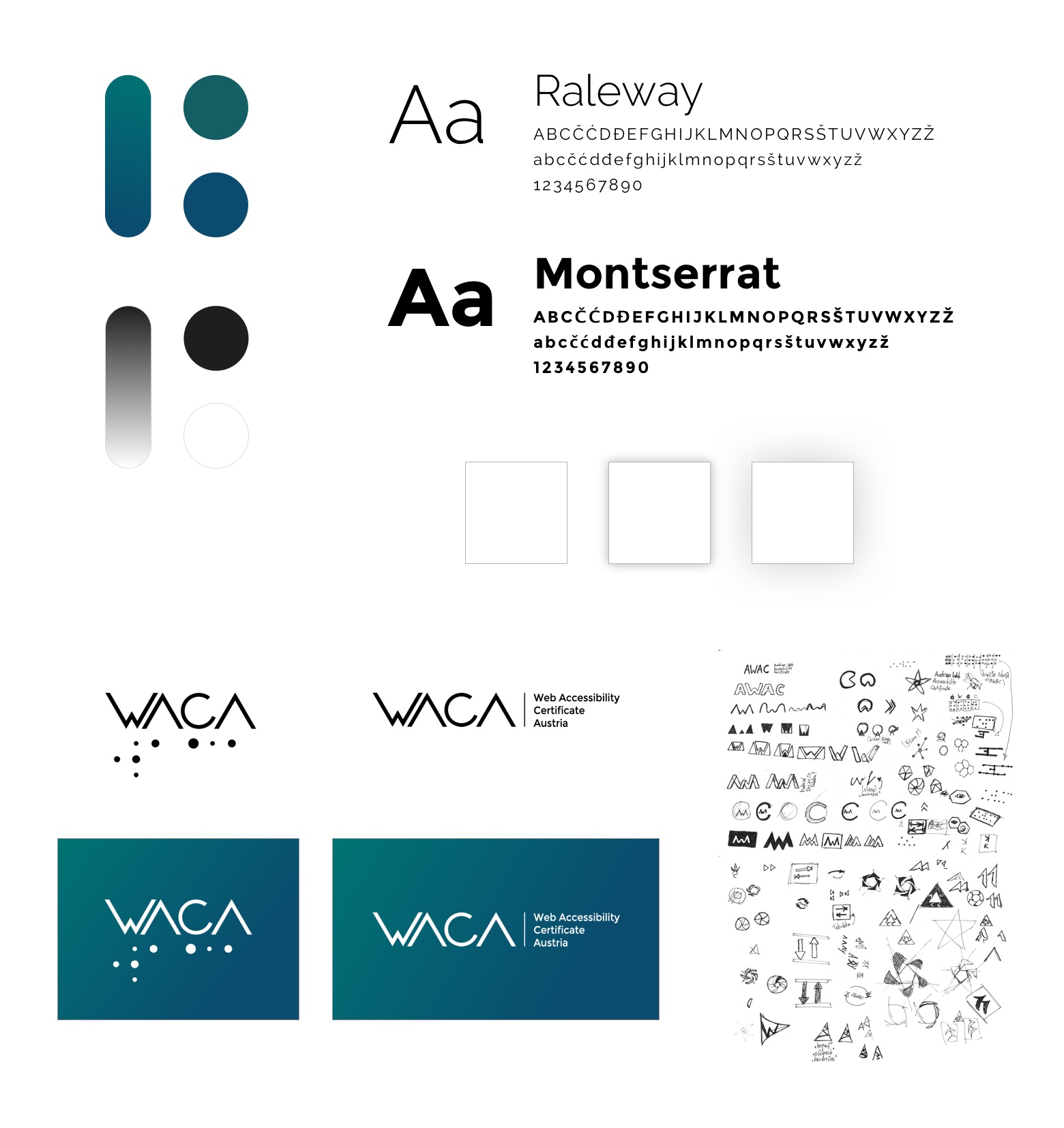
Ultimately, a simple, modern wordmark was created. Since the topic of accessibility naturally received particular attention in this project, a modified Braille script was incorporated as a graphic element, in line with it. Due to the slight variation in the size of the Braille dots, the logo appears dynamic yet remains true to its origin.
Optimal colour scheme
Next was the colour definition. I opted for strong blue and green tones to create a modern and fresh impression. The mix of the two colours makes the overall appearance calming, relaxing, and liberating, but at the same time powerful and friendly. If you want to use several colours for the design, you should also consider how the colours affect people with various visual impairments. A widespread colour vision deficiency is red-green colour blindness. This means that affected individuals find it harder to distinguish between red and green, and therefore also all mixed colours that contain these colours. There are several subcategories here. In the worst case, a red button next to a green button would look completely identical. To simulate this colour vision deficiency, Color Oracle offers a helpful tool. With it, you can check the most common visual impairments: Deuteranopia (green weakness), Protanopia (red weakness), and Tritanopia (yellow-blue weakness).
In addition to colour contrast, luminance contrast is also crucial when selecting colours. Here, of course, great importance was placed on accessibility, and to be prepared for the future, the WCAG 2.1 standard was taken into account. This specifies a colour contrast of 4.5:1 for text and 3:1 for large text (at least 18pt, which corresponds to approximately 24px). This is necessary so that all users can read the text optimally. There are various tools on the internet for checking colour contrast. I usually use the Color Contrast Checker from WebAIM, as it is intuitive and easy to use. To optimise the primary colours you have defined, it can be helpful to experiment in HSV colour mode. This allows you to define colour nuances more finely without changing the overall colour impression.
Accessible Websites – anything but boring. For the web design, I wanted to create a friendly and bright impression. Many companies are still deterred by the topic of accessibility and associate it with boring and sterile design. With the new design, I wanted to show that it is indeed possible to create an appealing accessible design. Open, light grey areas are repeatedly interrupted by modern and striking, rich colour gradients from green to blue, and these run throughout the entire design. This allows important accents to be set and the user's attention to be directed.
Elements of Material Design, which is characterised by a clear, clean structuring of complex content, were incorporated into the design. A key feature is the simulation of light and shadow using drop shadows. You read that correctly – the drop shadows from the early days of the internet are back! This can be very helpful if you want to prioritise a lot of information on different levels, but it should be used subtly and not overdone. And if you're now wondering if animated scrolling text and glitter effects have also returned – NO, they haven't!
I chose typography that was simple and generous. This makes reading easier and, in conjunction with ample whitespace, underlines the open character of the website. Of course, the entire layout was designed responsively to offer all visitors an optimal experience on all devices.

Towards an accessible future
With the ongoing expansion of content and functions, the WACA website serves as the primary point of contact for all topics related to accessibility. It forms a central platform for all matters concerning certification for an inclusive society on the web. If you are now considering having your websites certified, take a look at www.waca.at or read Wolfgang's blog post on certification. If you're still unsure, you should read Jo's article, which explains why accessibility on the web is an important topic.
For me, the Web Accessibility Certificate Austria project was very exciting and educational. Creating a complete corporate identity was challenging at first, but I immensely enjoyed it. There are many things to consider and develop that I don't do every day as a web designer. Above all, the opportunity to show that accessible web design can also be appealing and beautiful was a great motivation for me. I hope that through this, I can contribute to an accessible future and that many companies will decide to obtain the certificate for an accessible website.