
I hate them. The mathematically calculated colour combinations in Illustrator. Sure, they are perfectly correct, and the chosen complementary colours precisely match some impressive colour theory à la Goethe, Chevreul, Küppers and co., but they never evoke a "Wow".
Why even look at them?
Sometimes you just can't escape your own habits. When it comes to colours, we designers often gravitate towards tried and tested combinations. I don't mean we chase trends, but rather unconsciously keep landing on similar palettes. At least, I've caught myself doing it too.
Of course, many colours have fixed meanings. Red is bold, electronics are usually blue and yellow. For an environmental topic, you'd likely look at shades of green, wouldn't you? You could also seek fresh impetus from other websites or Illustrator palettes that offer neatly arranged colour squares as inspiration. However, for me, these "little boxes" aren't enough. I need something more lively to spark my brain. A new perspective is needed to break ingrained thought patterns.
By chance, during my inspirational explorations (the digital ones, not those requiring legwork), I stumbled upon two sites that I'd like to briefly introduce here.
Colour Palettes from Photos
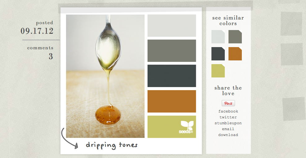
Design Seeds offers a brilliant concept. Each image has a lovingly chosen title. The combinations are often very fresh and can even be sorted under "palette search" by themes like "Vintage", "Vacation", or "Edible". Clicking on one of the colours searches for palettes in which that colour value appears. You can also search for your own colour, though this is only done via RGB sliders – numerical input isn't possible. Updates are available daily, so there are always new reasons to dive into this intuitive world of colour.
Colour Catalogue for Websites
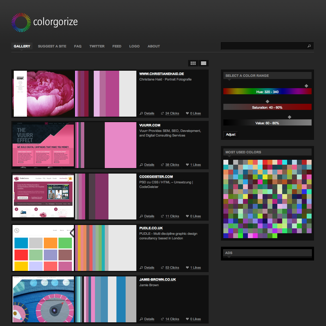
On Colorgorize, alongside the website screenshot, you'll find the colour spectrum, which also shows the proportion in which each colour appears on the page. Naturally, the pages in the catalogue are also linked to their originals. This colour site thus offers added value for web designers 😉
These two sites truly get my designer heart racing. If you're hoarding any treasures on this topic yourself, feel free to leave links in the comments.